Absurdity Abounds In The Energy Sector
Williams Companies (WMB) announced 2Q21 earnings on Monday. Results were largely in-line with expectations; Adjusted EBITDA came in at $1,317MM, $11MM ahead of forecasts reflecting the stability of their business. Their dividend is +2.5% YoY and is now expected to be 1.9X covered by Available Funds From Operations (analogous to the Distributable Cash Flow metric often used in the past by MLPs). The $1.64 dividend yields 6.6%. Under the old ~90% payout regime MLPs used to follow, WMB would yield over 11%.
6.6% is an attractive yield by any measure. Transco, WMB’s extensive pipeline network running along the eastern US, has investment grade bonds outstanding to 2050 that yield 3.06%. The equanimity with which bond investors accept equity-type risk for comparatively little is not unique to the pipeline sector. Rigid investment mandates partly explain the bifurcated market for WMB’s securities, and emphasize the continuing opportunity for equity buyers. Leverage (Net Debt:EBITDA) is expected to reach 4.2X by year-end, down from 4.35X the prior year.
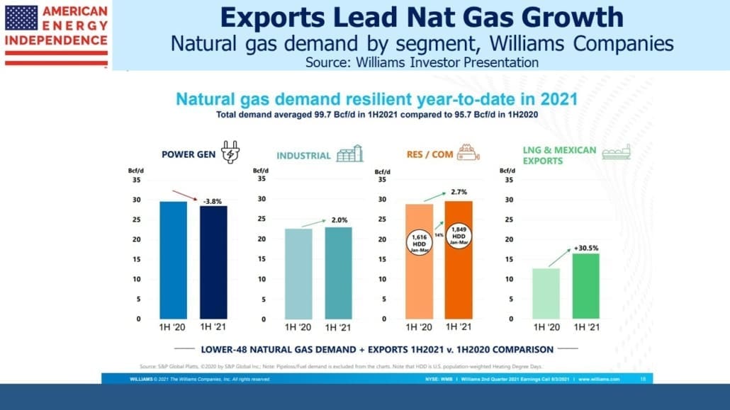
The energy transition notwithstanding, natural gas volumes passing through WMB’s pipeline network showed continued healthy growth. Of particular note was the 30% jump in natural gas for export, either as Liquified Natural Gas (LNG) or via pipeline to Mexico.
WMB is planning to invest $2BN to bring an additional 1.8 Billion Cubic Feet per Day (BCF/D) of natural gas to customers, mainly in the northeast. Careful examination of the map shows that the expansion only reaches as far as NJ and Pennsylvania. Massachusetts, which could surely use more natural gas, is currently debating whether to require that new construction omit natural gas connections (see Towns Trying to Ban Natural Gas Face Resistance in Their Push for All-Electric Homes). All-electric homes don’t sell as quickly as regular ones, reflecting a market push-back against the imposition of new regulations.
Residential power supplies are already prone to outages during bad weather, so it’s understandable that the prospect of becoming fully reliant on electricity even while utilities add intermittent renewables is not appealing. Natural gas never goes down.
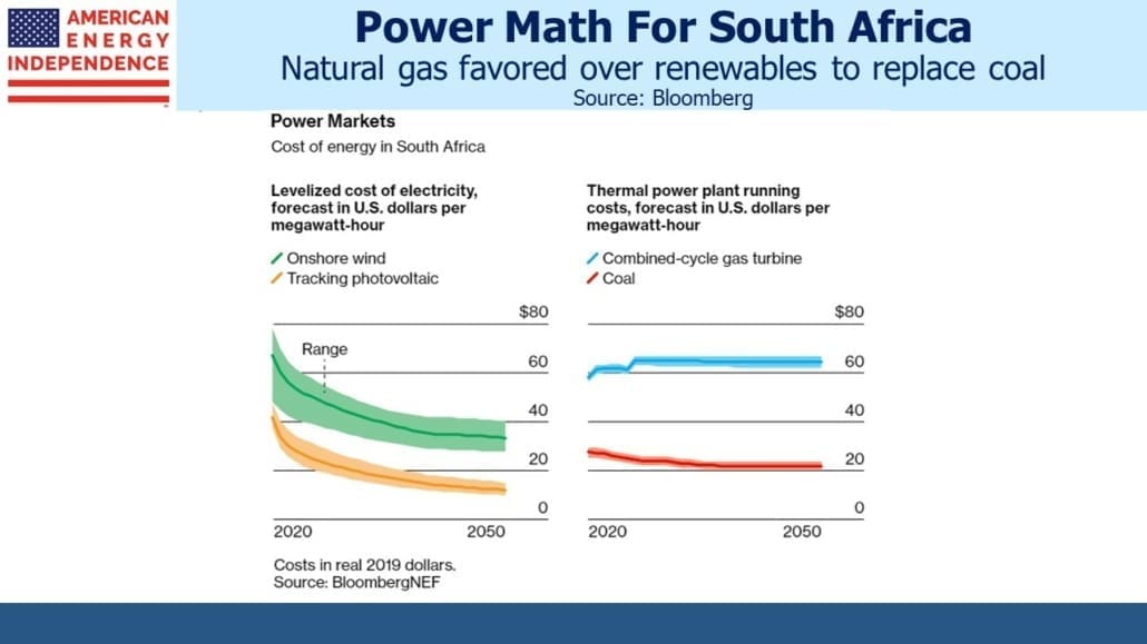
Meanwhile, South Africa is sensibly looking to natural gas as a way to reduce its CO2 emissions (see Coal-Reliant South Africa Is Turning to Gas Power). They estimate electricity produced using natural gas will cost 3X as much as from the coal plants that are nearing the end of their useful lives. Renewables may even be cheaper, but tellingly South Africa is willing to spend more for reliability.
In preparation for the COP26 UN meeting in Glasgow in November, environment ministers have been discussing the level of financial support OECD countries should be willing to provide to emerging economies to help them pay for the energy transition. It’s a valid debate, but not one that has yet caught the public’s imagination. South Africa’s Environment Minister recently suggested that $750BN per year would be needed in financial support from rich world countries. Assuming this burden was shared according to each OECD country’s share of OECD GDP, the US would be on the hook for about a third.
The prospect of the US paying $250BN per year to poor countries to speed their energy transition is sharply at odds with Joe Biden’s message that it was all about well-paid union jobs. There’s zero prospect that Congress would approve anything like this – but the fact that such figures are floated exposes the gulf between practical solutions and underlying political support. OECD countries have already failed to meet a $100BN pledge for 2020.
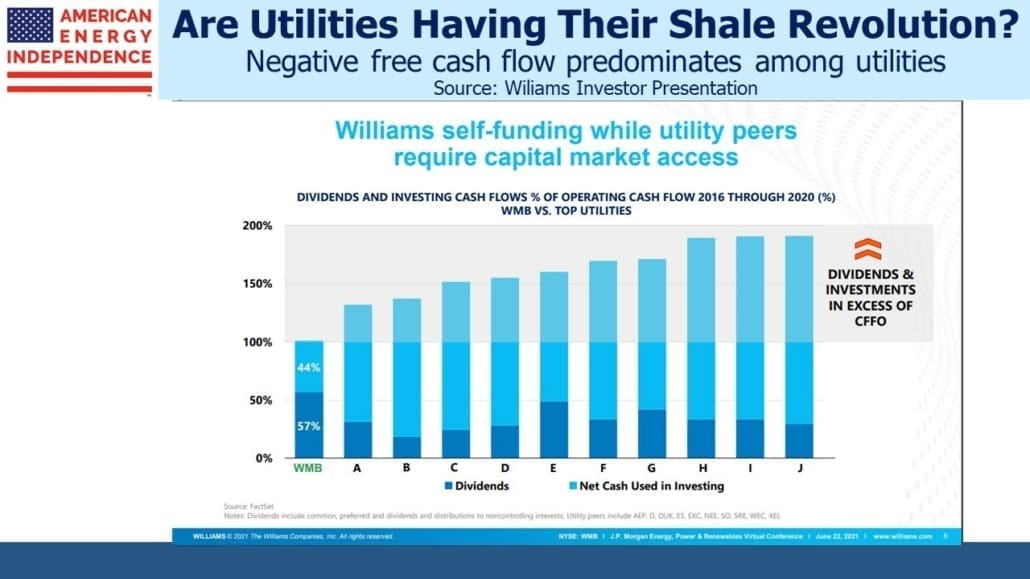
Returning to WMB, like most pipeline companies they self-funds their growth plans. Cash generated now goes to dividends and capex. Rising EBITDA reduces leverage and investors do not expect any dilutive secondaries.
This is in marked contrast to many utilities, which are spending $BNs on renewables and delivering negative Free Cash Flow (FCF) in the process. Today’s market forgives them because they’re investing in green projects. But battle-scarred US energy investors will recall the same willingness of Wall Street to overlook negative FCF during the early years of the Shale Revolution.
Germany has demonstrated that too much reliance on renewables leads to much more expensive electricity. California has managed to combine high prices with unreliability. Many of the utilities currently outspending their cash flow may find that expensive intermittency isn’t highly valued if they go too far, at which point the years of negative FCF will not look so smart.
Banning new natural gas hookups, outspending cash flow to build renewables and poor countries demanding GDP-sized payments to help reduce emissions; the energy sector is witnessing much that is absurd. Fortunately, natural gas pipeline transmission continues to grow reliably.
We are invested in all the components of the American Energy Independence Index via the ETF that seeks to track its performance.

