Kinder Morgan Responds to our Recent Criticism

To their credit, Kinder Morgan (KMI) responded to our recent blog (see Kinder Morgan’s Slick Numeracy). We exchanged several emails, although they declined our invitation to write a rebuttal which we promised to publish unedited. The company stands by their presentation, but did concede that some slides might have been more clearly labeled.

We had noted in our blog that the 5.9X EBITDA multiple on $12.3BN invested didn’t foot to the $1.8BN EBITDA from growth projects in the Bridge Chart. KMI explained this was because some investments they made had been sold in the meantime.

They believe that attractive returns on more recent investments have been masked by headwinds in their existing business. The EBITDA Bridge Chart blames the 2014-17 energy downturn for $0.6BN in reduced EBITDA from their CO2 business, which is net of new investment (i.e. CO2 growth projects are included in this figure). The $0.3BN drop in the Midstream segment was from lower volumes and tariffs in their pipelines.

KMI’s return on invested capital has drawn questions from others. A January 6 research report from Morgan Stanley placed KMI’s 2017-18 Return on Invested Capital (ROIC) at 4.5%, worst out of 12 peers. In October, Wells Fargo calculated a 2013-18 cash return on investment of 4%, 2nd worst in the group and declining.

In response, KMI referred us to a slide showing ROIC by segment. They say they have discussed the Wells piece with the firm, and make a distinction between recently invested capital and returns on legacy assets.

The ROIC slide incorporates some complexity. The footnote reminds that pre-2014 returns are from Kinder Morgan Partners (KMP) and El Paso (EPB), which is where KMI’s operating assets were held before being rolled up into the parent. Those were the days of Incentive Distribution Rights (IDRs), when KMP and EPB both paid a share of their returns back to their controlling general partner, KMI.

Once the IDRs went away, returns might have been expected to jump. That they didn’t suggests that the chart treats IDRs as a cost of capital and not as an expense to KMP and EPB, which they most assuredly were. So we think the returns are on the assets, not on what KMP and EPB unitholders earned on those assets.

KMI believes they are making a genuine effort to present their case, and in providing so much detail they create opportunities for investors like us to look for inconsistencies. But we think that EBITDA multiples aren’t a good way to do it. The declining ROIC chart is hard to reconcile with higher recent returns. It also highlights the volatility of the CO2 business, which they evidently believe can get back to the returns it generated a decade ago. The fact that they haven’t yet received a sufficiently attractive offer for this segment means few share their optimism.

The company uses IRR in allocating capital. They say new projects require unlevered pre-tax returns of 15-20%, but their ROIC chart shows returns sliding towards 10%. At some point the high return investments of recent years must lift their overall ROIC. EBITDA multiples can flatter – a project with declining EBITDA (like a CO2 investment) might look superficially attractive based on Year 2 returns but ultimately not cover the cost of capital. The company is adamant they’re not allocating this way. So why not show expected IRRs on new investments?

We appreciate KMI’s effort to reach out – “slick numeracy” probably didn’t gain us any additional friends there. Along with countless other long-time investors, we’re frustrated that KMI remains well below the highs of 2014. Their stable, fee-generating assets ought to draw a higher valuation.

Planting a Cooler Climate

A little noticed sentence in President Trump’s State of the Union speech was that the U.S. would join the Trillion Trees Initiative. He didn’t mention climate change – most people like trees anyway, and the link was obvious. But planting trees to combat climate change is so seductively simple that it must be impractical. A trillion trees is a lot, and mentioning it in a prime time speech will have caused at least half the country to dismiss a political gimmick.

So we looked at the plausibility of harnessing nature to consume the excess CO2 humans are generating.

To grow, trees require CO2 and water, which through photosynthesis they convert into carbon and  glucose to form the tree, and oxygen which they emit. Growing 1 ton of wood requires around 1.55 tons of CO2. By atomic weight, carbon is 27% of a CO2 molecule. A dry tree is typically around 50% carbon.

Of course trees vary enormously in size. The University of Arkansas Division of Agriculture publishes a handy guide for estimating the weight of a tree given the measured circumference.

From this, we estimate that the average hardwood tree weighs 3.4 tons dry, or about 3.1 metric tonnes (the unit that’s used for CO2 emissions). Assuming it grows over 100 years, it’ll require half its weight in carbon (1.55 tonnes), which will be extracted from 5.7 tonnes of CO2 (i.e. 1.55 divided by 0.27).

The world generated 33 gigatonnes of CO2 last year. Divided by the 5.7 tonnes consumed by the average tree, planting 5.8 billion trees would, over their life, consume all the CO2 emissions of last year.

Is this possible? Earth currently has 3.04 trillion trees, so we’d need to increase the stock of trees by just 0.19% per annum to take a giant step towards combating global warming.

Last year, one million Indians planted 220 million trees in a single day, as part of a government campaign against global warming. Ethiopia planted 353 million trees in 12 hours.

America plants 1.6 billion trees a year – half by forest product companies. Costs are estimated to be as low as 30 cents a tree.

Even if this analysis is out by a factor of 10X, that would still leave the world needing to add 1.9% to global forests every year – certainly viable if embraced as a solution.

Planting trees is labor-intensive. But two companies, Droneseed and Dendra Systems, are developing plans to use drones that can plant seeds on hundreds of acres a day, versus the two acres that a professional tree planter typically covers. You can watch two interesting videos explaining how here, and here.

So it would seem that a global effort to add around 6 billion new trees every year is achievable.

Articles like World losing area of forest the size of the UK each year, report finds in the UK’s Guardian stoke fears of enormous global tree loss. Brazil is widely criticized for deforestation in the Amazon, but overall the portion of the world covered with trees has been growing. This is partly because a warming planet is raising the tree-line in mountainous areas, and allowing forests to creep into tundra.

Environmental extremists have instinctively rejected the Trillion Trees Initiative, for mostly predictable reasons: it doesn’t require overhauling our energy supply, or erecting millions of windmills, solar panels and tens of thousands of miles of ugly high voltage electricity lines. It seems so much more attractive than the Green New Deal.

Renewables, nuclear and natural gas are all part of the solution to climate change, along with adding billions of trees. Burning natural gas produces water and carbon dioxide, the two inputs trees need to grow. Burning coal releases nitrogen oxides, sulfur dioxide, particulate matter, mercury and other hazardous substances that the local population inhales. Everyone should be able to agree that coal use must drop.

Most of the criticism of the Trillion Trees Initiative stems from concern that it’ll weaken the case for dramatic interventions to the economy promoted in the Green New Deal. That’s precisely why it’s appealing.

U.S. Natural Gas Helps Lower Emissions Again

Blackrock’s ESG funds hold positions in pipeline corporations, consistent with Larry Fink’s recent letter on climate change (watch ESG Investors Like Pipelines).

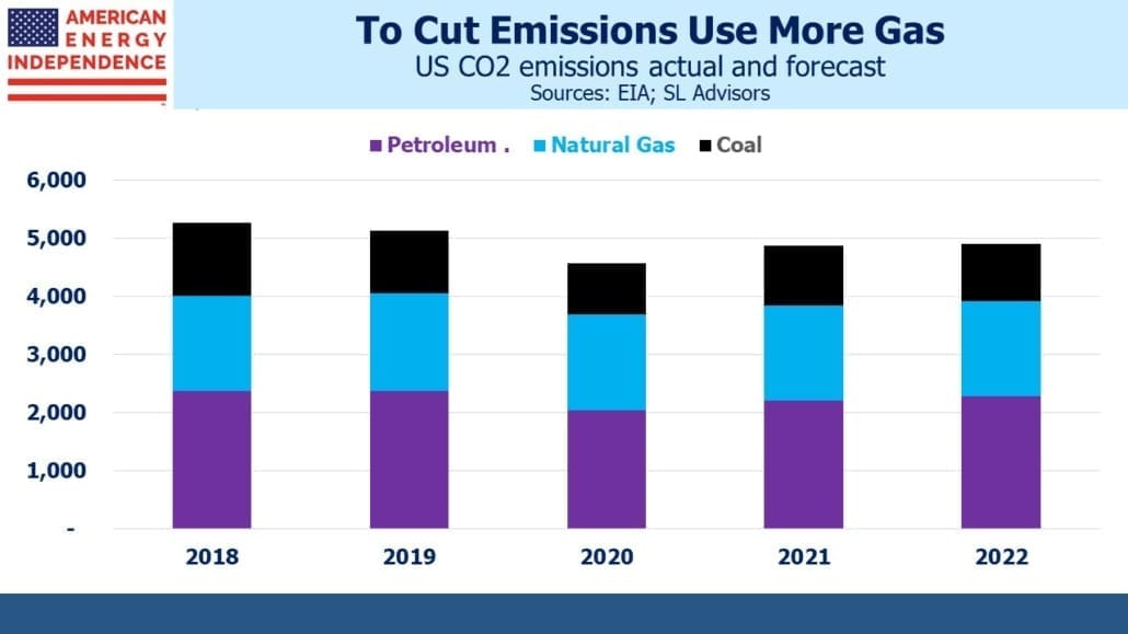
Their inclusion is entirely appropriate. The International Energy Agency recently announced that global CO2 emissions last year were flat, at 33 gigatonnes (a gigatonne is 1 billion metric tonnes). The U.S. lowered emissions more than any country – by 140 million tonnes, a 2.9% reduction.

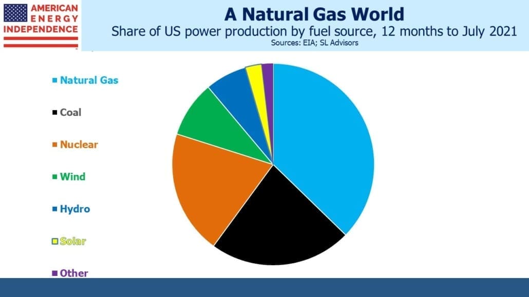
Increased use of natural gas was an important contributor, because it’s substituting for far dirtier coal. In 2018, using the most recent figures available, natural gas produced 35% of America’s electricity, versus 27.5% for coal. Wind was 6.5% and solar 1.5%.

Other developed countries also saw reduced emissions. The EU saw a drop of 160 million tonnes, and Japan 45 million tonnes. The U.S. not only had the biggest absolute reduction, but on these figures also the biggest per capita drop: 0.42 tonnes per American, versus 0.31 tonnes per EU citizen and 0.35 tonnes per Japanese citizen.

The U.S. Shale Revolution has made this possible. Natural gas prices may be ruinously low for E&P companies, but this has enhanced its competitiveness all around the world.

The CO2 reductions from developed countries were offset by increases from developing countries. China and other non-OECD countries are more concerned with raising living standards than lowering emissions, which is chiefly a rich world concern. The Paris Climate Accord accepted increasing emissions from developing countries for this reason.

One of the most damning statistics is that China’s annual per person CO2 emissions of 9 tonnes per annum are higher than the EU at 8 tonnes. India is at 2 tonnes.

The U.S. is at 16 tonnes, but this has been falling sharply over the past couple of decades.

China’s relatively high per person emissions are partly a result of their mix of inputs – they burn half the world’s coal. While developed countries are managing to lower emissions, China is undoing most of the benefit. Given their track record, rising Chinese living standards will represent a significant setback to global efforts on emissions – an issue rarely acknowledged by climate extremists.

Meanwhile, U.S. pipeline corporations are helping reduce America’s emissions, drawing ESG-dedicated capital from Blackrock and others. It’s one of the biggest successes in climate change

Today’s Pipelines Leave MLPs Behind

Last week Kelcy Warren, CEO of Energy Transfer (ET), defended the MLP structure. He’s definitely correct that MLPs possess a powerful tax advantage over corporations, in that their profits are only taxed at the investor level. Tax-deferred income free of the double-taxation to which corporate profits are subject is very appealing, and for years it drew countless buyers. Unfortunately, Warren is part of the reason that the MLP structure is losing favor. Midstream energy infrastructure and MLPs used to be synonymous, but widespread distribution cuts and investor abuse have left the old, rich Americans who used to be the investor base betrayed.  The names Kelcy Warren and Rich Kinder still elicit strong reactions from longtime MLP investors.

The Alerian MLP ETF, a good proxy for how MLPs have performed, has cut its distribution by 34% since the market peak in 2014. Companies chose to finance growth projects in excess of free cash flow, and ultimately resorted to either outright distribution cuts or “backdoor” distribution cuts by merging with a their lower yielding corporate general partner. Many MLPs abandoned the structure, and income seeking investors in turn have abandoned the remaining ones.

The result today is that MLPs represent 36.5% of the sector by market capitalization, as defined by the Alerian Midstream Energy Index — AMNA (see MLPs No Longer Represent Pipelines). Kinder Morgan, ONEOK, Enbridge, Targa Resoures and Williams Companies are among those that have fully adopted the corporate structure.

MLP-dedicated mutual funds and ETFs were originally designed to offer sector exposure to retail investors who didn’t want to deal with K-1s. They saddled their investors with a ruinous tax burden, because funds with over 25% of their portfolios in partnerships (which is what MLPs are) have to pay corporate tax. It seems odd to take a tax-efficient vehicle and add taxes to it, but showing how few investors read the fine print, these products took hold. And they’re now focused on just 36.5% of the sector (see Are MLPs Going Away?).

To illustrate how much things have changed, just two names, Energy Transfer and Enterprise Products, represent 43% of the market cap of all MLPs.  Dedicated MLP funds are forced to drastically underweight these two, which leaves them with outsized exposure to the smaller MLPs. They’ve moved a long way from diversified portfolios of large, fully integrated “toll road” pipeline systems that originally attracted investors.

The biggest of them, the Alerian MLP ETF, has since inception delivered less than one third of its index. This is probably the worst performing index ETF in history. Corporate taxes have taken a bite, and when the sector delivers a couple of big years the tax hit will be even more noticeable (see MLP Funds Made for Uncle Sam). The 1.04% since inception annual return is not far from the 0.85% advisory fee, putting AMLP in the company of the hedge fund industry in making profits while the clients don’t.

If you ever meet one of the hapless souls who’s chosen AMLP, you’ll find they’re probably unaware of the tax drag.

The shrinking number of MLPs has rendered MLP-dedicated funds less representative of the sector. Of the ten biggest North American pipeline companies, six are corporations and so excluded from AMLP and its cousins. Every time another pipeline company leaves the publicly-traded MLP universe, these funds are left with fewer names and a preponderance of small ones. The market has shifted since many of these were launched a decade or more ago (see AMLP’s Shrinking Investor Base).

If any of these funds decides to reduce their MLP exposure below the 25% threshold, so as to be more representative and avoid corporate taxes, it’ll depress MLP prices because many will have to sell three quarters of their holdings. A quarter of the $135BN in public float for all MLPs is held by $34BN in MLP dedicated-funds. It’s a crowded space.

Moreover, AMLP reflects the worst of MLPs – AMNA is 21% Gathering and Processing (G&P), the more risky end of the midstream business because it’s more dependent on production from specific areas. Due to limited choices, AMLP has 26% exposure to G&P. Even worse, natural gas pipelines are a big underweight in AMLP, even though the long term prospects for natural gas are more visibly positive than for crude oil and liquids. Natural gas pipelines represent 46% of AMNA, but only 27% of AMLP. So AMLP investors have an overweight towards crude oil and liquids.

Investors are starting to act on the many flaws of MLP-dedicated funds. Over the past year, $4.1BN has left the sector. The American Energy Independence Index is investible (you cannot invest directly in an index) and has weights that are more reflective of the industry. Its holdings are mostly corporations, which reflects today’s pipeline business. Several names are ESG holdings for Blackrock and other big fund managers, but MLPs don’t pass ESG screens because of poor governance (watch ESG Investors Like Pipelines). The broader investor base and ESG qualities helped pipeline corporations outperform MLPs last year.

Disclosure: our affiliated investment products are structured to reflect the insights listed above.

Crude Catches a Virus

We’re in one of those times when everything is a macro call. Stocks and sectors are, for now, more highly correlated, since Coronavirus developments are dominant. Click here for some cool graphics illustrating its spread. The recent recovery in stocks echoes the information on the link.

We won’t attempt to offer any insight on the virus, but have some observations on energy markets.

Recent reports suggest that China’s crude demand is down by around 20%, or 3 million barrels per day (MMB/D). OPEC is apparently considering temporary cuts of 0.5 MMB/D and could perhaps reduce by 1 MMB/D. That still leaves the market over-supplied by 2.0-2.5 MMB/D, although China’s imports should hold up relatively better as it builds strategic reserves.

Libya’s production has fallen by around 1 MMB/D, from 1.2MMB/D to just 0.2 MMB/D recently, because of the ongoing civil war there. However, they are holding peace talks and a cease-fire agreement may be reached soon.

Before the Coronavirus hurt demand, we had thought U.S. shale output was likely to come in below expectations (see Why Oil Production May Disappoint).  Oil wells experience faster depletion than natural gas, which means that as shale production grows an ever increasing number of new wells is needed to compensate for the production drop-off experienced by older wells. We also noted the sharp drop in “DUCs” (Drilled but not yet Completed), which become the source of future production when they’re completed.

Schlumberger, the world’s largest oil field services company, recently announced plans to pull back from shale oil because they see so many E&P companies struggling to be profitable. In announcing results last month, CEO Olivier Le Peuch said, “North America revenue of $2.5 billion…dropped 14% sequentially due to customer budget exhaustion and cash flow constraints.”

Capital is clearly becoming constrained. Natural gas-dedicated E&P names such as Chesapeake and Range Resources have seen their stock fall 95% or more from peak levels more than five years ago. Even the biggest companies such as Exxon Mobil trade at historically low valuations.

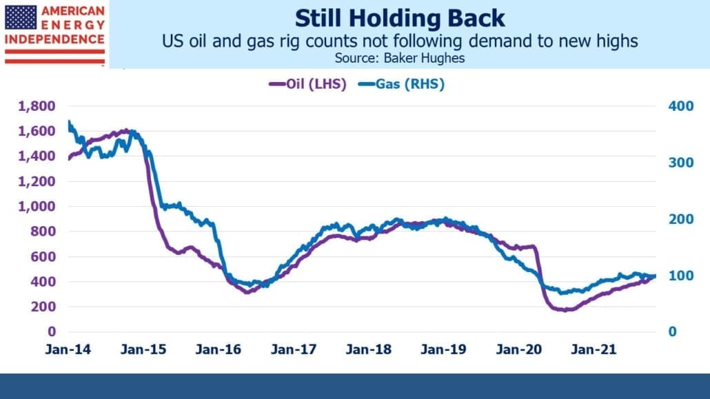
The rig count has been sliding for some time amid weak crude oil prices and steadily sinking natural gas. The Coronavirus-driven sudden drop in crude prices is likely to cause a further pullback in the rig count drilling for shale oil, restraining production growth.

The caveat is increasing efficiency of production. The U.S. Energy Information Administration recently noted that oil and gas production grew in 2018 even while the number of wells in operation fell 10%. Doing more with less has been a hallmark of the Shale Revolution since its infancy. However, this reaches a limit as the least efficient rigs drilling the highest cost acreage are the first to be laid down, leaving the high-tech rigs in the sweet spots.

Depending on the length of economic disruption caused by the Coronavirus, supply may need to adjust. Low prices are the best cure for oversupply. Saudi Arabia has signaled they’re willing to cut production with OPEC to get the price of oil higher, and can maintain its lower production quotas after demand has recovered. U.S. activity demonstrates that shale oil growth was already moderating before recent developments. Meanwhile, many forecasts see the physical oil markets shifting to a multi-year deficit in the back half of 2020 and tension in the middle east remains elevated as the US continues its maximum pressure policy of sanctions on Iran.  With the many cross-currents, energy investors remain on the edge of their seats.

Kinder Morgan’s Slick Numeracy

A Chief Financial Officer needs to know her way around a financial statement. Presenting operating performance in the best possible light is a highly valuable skill. We watched Kinder Morgan’s (KMI) Analyst Day last week via webcast, and my admiration is split between (1) KMI President and former CFO Kim Dang’s deft maneuvering among numbers, and (2) my detail-oriented partner Henry Hoffman for spotting the sleight of hand.

The story begins where KMI uses a “bridge” chart to show how EBITDA changed from 2014 to 2020. Dang introduced the slide as answering a common investor question: if you’re doing so well, why isn’t EBITDA growing more?

The chart includes the much criticized CO2 segment, which sells CO2 for Enhanced Oil Recovery (EOR) as well as being used by KMI itself for that purpose. CO2 contributed a $0.6BN decline to EBITDA from 2014-20. Since its decline is shown on the chart, it must also be part of the $1.8BN EBITDA increase from Expansion Projects, because the $7.6BN 2020 Adjusted EBITDA is for all of KMI.

Another slide shows an attractive EBITDA multiple on capital invested, of 5.9X. In other words, $100 invested will return its capital invested over 5.9 years. The reciprocal of 5.9X is the return, a juicy 16.95% in this case and well over KMI’s assumed cost of capital. The 5.9X multiple implies these projects are generating $2.08BN in EBITDA.

But the small print notes that on this slide, CO2 segment Expansion Projects are excluded.

To find out what KMI invested in CO2 projects 2015-19, we turn to another slide, which shows annual figures.  Adding up the Capex for 2015-19 gives $2.18BN.
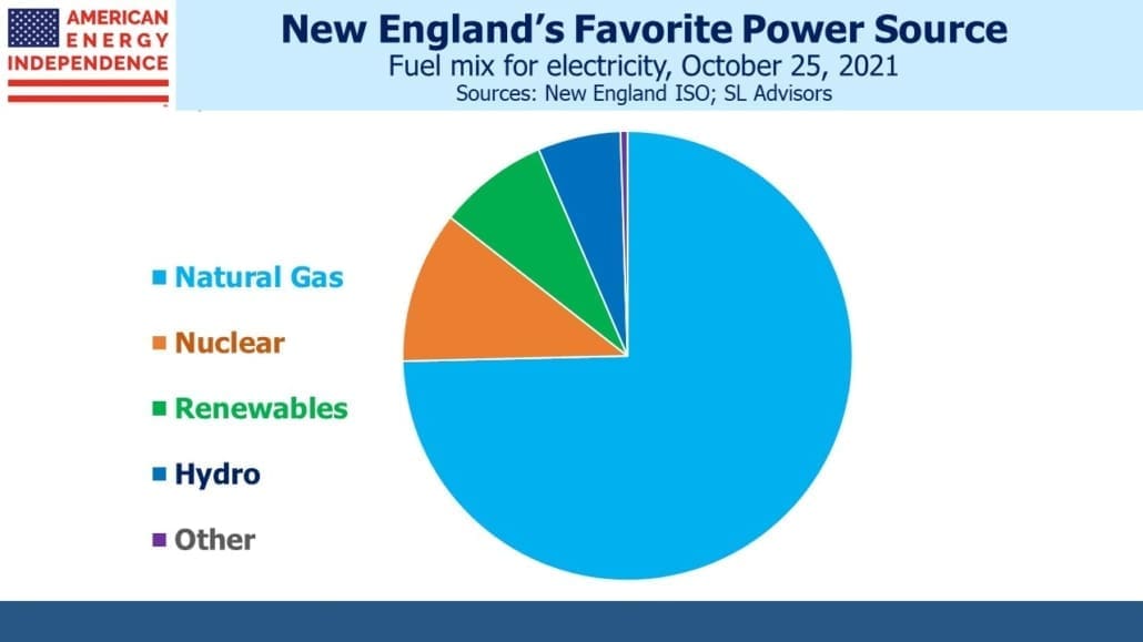
So KMI’s total capex over the period covered was not $12.3BN but $14.48BN,  once you add back CO2.

This makes the EBITDA multiple on new investments a little less stellar. The $1.8BN in EBITDA from Expansion Projects that required $12.3BN in investment equates to a 6.78X multiple. But since we know the $1.8BN EBITDA is from all Expansion Projects, including the CO2 business, it’s appropriate to add back the $2.18BN invested in CO2 Expansion Projects to get the true total.

That means the $1.8BN in “growth” EBITDA was earned on $14.48BN in capex, or a multiple of 8.04X. That’s 12.44% rather than the 16.95% calculated earlier. It’s pre-tax, and excludes interest expense as well as depreciation.

KMI uses more than one EBITDA definition through these slides, so you have to follow carefully. When calculating the EBITDA multiple, they like the “Year 2 Project EBITDA”, with its implied $2.08BN in EBITDA. The EBITDA bridge chart simply shows 2020 EBITDA of $1.8BN from all new projects initiated since 2015. Why are they different, and what does it mean?

Investment outlays have been falling since 2015, which means that the projects funded since then are, on average, past the two year mark. 2020 capex is almost a third lower than it was in 2015.

Since the $2.08BN “Year 2 Project EBITDA” is above the $1.8BN 2020 EBITDA from Expansion Projects in  the bridge chart, and we know the average project is more than two years old, it means that EBITDA from new projects is declining. Using the “Year 2 Project EBITDA” flatters the results. Management teams persist in using EBITDA multiples, which are easily manipulated, rather than NPV and IRR. It’s as if they don’t think their investors will understand them – or maybe they’ve concluded that EBITDA multiples are easier to obfuscate.

Following this is admittedly a complicated exercise, but it illustrates the agile numeracy required of today’s energy sector CFO, and of the investors interested in properly understanding their business. KMI is certainly not alone in using financial complexity to their benefit. In this case, we think it’s driven by their continued retention of the CO2 business, which they should sell. Apart from that, KMI has some great assets.

We are invested in KMI

Washington-DC Based Energy Experts Offer Their Outlook

We had an opportunity to meet with a Washington-DC based independent research firm, specializing in energy policy and geopolitics last week.  The following is from our notes on their discussion.

On Iran, one principal, a highly decorated ex CIA officer and Iran expert, thought markets continue to underestimate the risk to oil infrastructure and production in the region. He expects tensions to increase in the months ahead, possibly leading to direct negotiations with the U.S. in 3Q20. He expects asymmetric attacks to resume once plans are approved by Supreme Leader Khamenei, with military confrontations in Iraq but energy infrastructure targeted elsewhere in the Middle East. He placed the odds of a major escalation at 25%, most likely as a result of a miscalculation followed by a disproportionate U.S. response (“Trump likely to hit back 10X”).

We would note that U.S. infrastructure assets should look relatively more attractive to investors in the scenario described above (see Gulf Tensions Back in Play).

On Libya, he noted that the lost output of 1 Million Barrels a Day (MMB/D) has had muted impact, because OPEC retains excess supply well in excess of that. He also thought that Saudi Arabia was willing and able to make further cuts if needed, as long as others are in compliance.

Contrary to consensus, he sees Venezuela increasing output to 0.8 MMB/D, because the current bottleneck is in marketing. The fact that the U.S. has allowed Chevron and others to continue business in Venezuela suggests a tacit acceptance of exports finding their way to market.

On Electric Vehicles (EVs), China recently cut EV subsidies but also relaxed restrictions on conventional internal combustion engine vehicles. This illustrates China’s preference for economic growth over reduced greenhouse gas emissions, something we’ve often noted (listen to our podcast China Keeps Warming the Planet). Another expert who specializes in energy policy matters also argued that technical requirements for mandated emission reductions in Europe render them unachievable, and that strong SUV sales will support gasoline demand.
The discussion turned to domestic politics and what changes could be expected with a Democrat in the White House (not currently anyone’s forecast). By contrast with Obama’s view on natural gas, which this policy expert regarded as relatively clean and a “bridge” fuel towards decades-long development of renewables, he noted that today’s Democrats view natural gas as just another fossil fuel. He predicted that a Democrat president would likely impose an immediate ban on new leases on Federal land. Current Gulf of Mexico production is 2 MMB/D, and onshore from Federal land is around 1 MMB/D.

Around 1/8th of natural gas is extracted on Federal lands, but this is more easily replaced with increased production on private acreage. He also expects a new administration would rescind existing permits on Federal land, and although courts would likely disallow this, resolution could take a while. Tighter rules on methane leakage and waste prevention are likely, which would eventually impede production on private land. The granting of infrastructure permits would become highly political, with FERC likely to become partisan. No new LNG export permits should be expected.

Democrat policies would likely reduce U.S. supply, exacerbating Middle East tension by increasing U.S. reliance on OPEC imports (see Energy Strengthens U.S. Foreign Policy).

Overall we felt there were several differentiated insights from the discussion and wanted to share them.

Why Oil Production May Disappoint

E&P companies routinely drill wells but hold off completing them until a later date. Completion includes creating a cement outer wall for the well to avoid leaks, and firing holes in the exterior in preparation for injection of fracking fluid under pressure. Typically wells can be drilled in sequence, as the drilling equipment is moved to the next site, but are completed in batches once a fracking crew is available. Drilled but Uncompleted wells (“DUCs”) are a form of production inventory, in that they represent future output once completed.

The Energy Information Administration collects data on DUCs, and it usually tracks production pretty closely. There’s an underlying assumption that a DUC will eventually be completed, but sometimes a drilled well is a dud, or completing it never becomes economically viable. Some believe that the EIA’s measure of DUCs is substantially overstated. This matters to future production, because fewer wells to be completed means less output, until more wells are drilled.

A characteristic of shale oil wells is that they deplete faster than natural gas. As crude production has increased in the U.S., this means that an ever greater number of new wells need to be drilled in order to compensate for depletion from an ever increasing number of current wells. Because this can’t happen indefinitely, production growth has to slow from it past torrid pace. We explored this in Drilling Down on Shale Depletion Rates.
The time from drilling to completion varies and doesn’t ultimately affect output, according to a study last year from the EIA (see Time between drilling and first production has little effect on oil well production). But it’s also true that the longer a well remains a DUC, the less likely it is to ever be productive.

Currently, we’re completing around 1,200 wells per month. The EIA study referenced above estimated 3-4 months on average between drilling and completion – this was based only on North Dakota, so subsequent inferences rely on that single region to represent the country. But assuming the 3-4 months applies more broadly, that implies 3,600 to 4,800 DUCs in rolling inventory.

In recent months, DUCs have fallen noticeably although tight oil production has continued to grow. At around 7,500, DUCs are only modestly above our assumed rolling inventory. Because production has begun to diverge from DUCs, it suggests either drilling activity must pick up sharply to restore DUCs to output, or output itself will fall.

This doesn’t allow for any overestimate of DUCs by the EIA. Criticism from industry executives include comments such as, “My sense is the EIA DUC number implies more production capacity than actually exists and leads to downward revisions of supply estimates, which we have seen in the last six months.” Another added, “The EIA has no clue on their estimated number of DUCs, in my opinion.” Sadly, the executives are unnamed in last September’s piece from S&P Global Platts (see US producers criticize EIA estimates of DUCs, clouding production outlook).

Others seem to agree though. Raymond James estimates that the EIA is overstating DUCs by 2,000 wells.  Spears & Associates believe the EIA may be overestimating DUCs by 3,000.  In the last six months of 2019, completed wells exceeded drilled by 140 per month on average.  If Raymond James and Spears & Associates are right about the EIA’s overstatement, then we’re already out of true DUC inventory.

The EIA is forecasting 13.3 Million Barrels per Day (MMB/D) of U.S. crude oil production this year, up from 12.2 MMB/D.  The falling DUCs and possible overcounting create downside risk to this forecast, and upside potential for oil prices.

image_pdfimage_print