Covid By The Numbers
The recent news on Covid-19 has been mostly bad. Infections are increasing sharply in sunbelt states, where Florida now holds the record for two worst days’ new infections – 15,300 and 13,965, both reached last week. Reopening plans are being halted. Even the Republican convention scheduled for late August, which was moved from Charlotte, NC to Jacksonville, FL (i.e. from a Democrat governor to a Republican one), has been scaling back its planned attendance.
We’ve aimed to be apolitical in covering what is the biggest story concerning investors nowadays (see Taking The Politics Out Of Covid-19). Writing about this is a fraught subject – you don’t want to get Covid-19, and there have been over 140,000 deaths each one of which is a tragic loss. It continues to be a traumatic time for the country. My mother is high risk, in assisted living, and our interactions with her are constrained in both frequency and form.
Nonetheless, we focus on the data, which we interpret as more optimistic than the media coverage for the overall population. Some readers have criticized us for this. Equity markets clearly have a more sanguine view (see Is Being Bullish Socially Acceptable?), and investors may be wrong or they may collectively also be interpreting the data as more positive. We think it’s worth trying to understand the implied relative optimism, as it contrasts so strongly with how many of us feel.
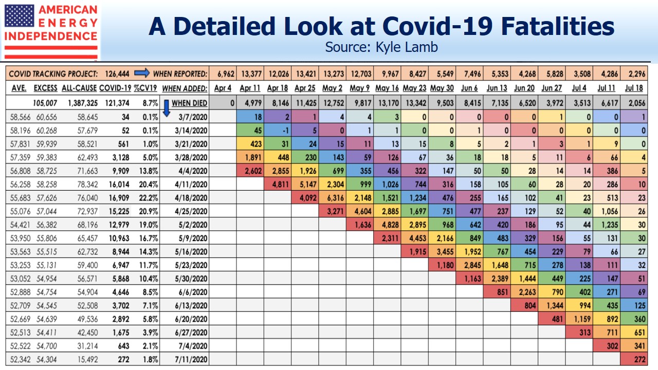
With that preamble, let me introduce a fascinating table that Kyle Lamb has recently posted on Twitter analyzing Covid-19 fatalities. Some effort is required to fully appreciate the depth of information it contains – we’ll explain:
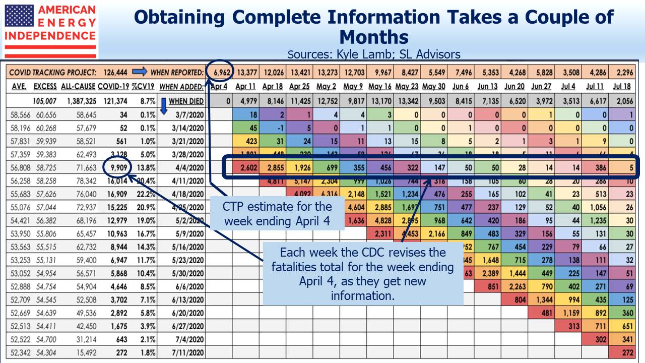
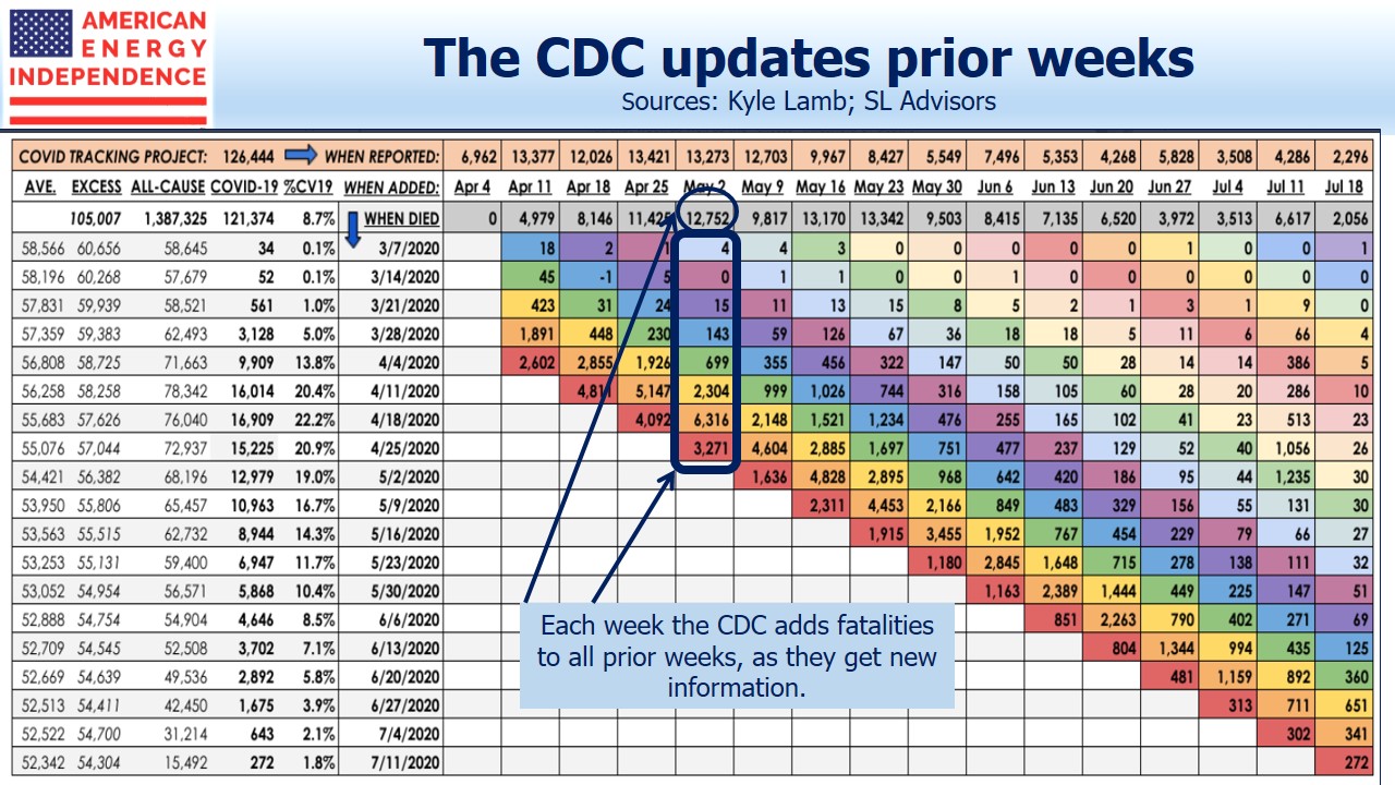
The Center for Disease Control (CDC) publishes a Provisional Death Count which tracks “deaths involving Covid-19”. CDC data relies on death certificates being processed, so lags by several weeks the data published by the Covid Tracking Project (CTP), which is what most media outlets use. Although both produce weekly data, the CDC updates prior weeks for a couple of months, as they receive new information.
For example, reading off the table for the week ending April 4, CTP shows 6,962. The CDC data shows 9,909, a figure they’ve been revising up every week. The first time they reported a figure for April 4 was on April 11, and it was 2,602. If you sum all the colored cells horizontally, you get the fatality total for the week in the “When Died” column.
If you sum the colored cells vertically, you get what the CDC revisions to prior weeks totaled.
Both have revised their websites to higher figures since the table was produced.
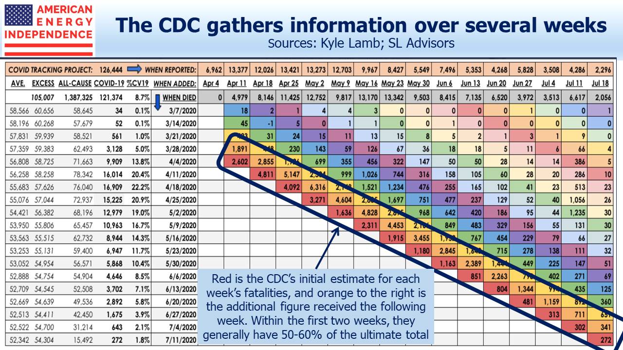
What the table does is break down the CDC fatalities for any given week into multiple weekly buckets to show when they were reported. So the red cells show the CDC’s initial estimate of fatalities for that week. Moving to the right, the orange cells show the number of additional fatalities added to that week’s total a week later.
So what’s the point? Although the CDC’s initial weekly estimate is always revised up, after eight weeks they have most of the data. Within the first two weeks, they typically have 50-60% of the ultimate total for that week.
On April 18, the CDC reported 4,811 deaths for the prior week, a figure that eventually rose to 16,014. The most recent week on the table, ending July 18, shows 272 for the prior week (more recently revised up to 1,099 on the CDC website, which could mean faster reporting or increased fatalities). As the CDC’s initial weekly estimates are falling, it’s reasonable to assume that the ultimate figures will also fall. Clearly sunbelt states are seeing increases, but today’s infected patients are faring much better. They’re younger and are benefitting from improved treatments. Nursing homes have learned to better protect their highly vulnerable residents. CTP fatalities remain well under half the levels of April, when New York was the epicenter.
Stocks continue to trend higher. You should still wear a mask, practice social distancing and wash your hands frequently, as we do. But we’re getting through this.


